From Spreadsheet to Presentation-Ready Chart in Under a Minute
Most people do not open a spreadsheet because they enjoy formatting charts. They open one because a slide deck is due in an hour, a teacher needs a diagram for tomorrow’s lesson, or a lab report needs a figure that actually looks finished. The chart itself is never the goal; it is the obstacle between the data and the deadline. A free browser utility called Table To Chart attacks exactly that obstacle: paste a table, pick one of eleven chart styles, and download a clean image, with no account and no watermark standing in the way.
Why built-in spreadsheet charts feel so slow
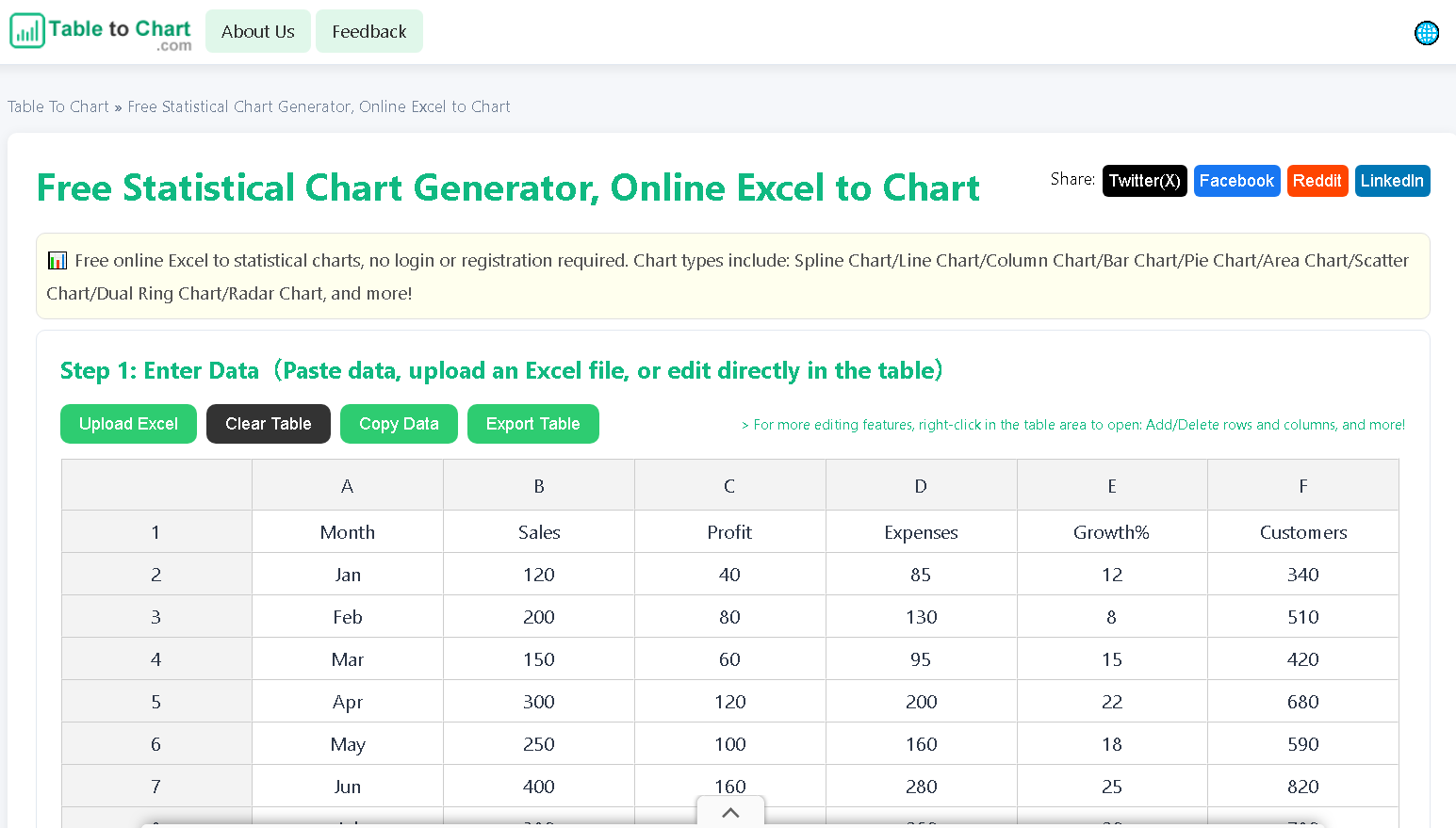
The idea behind the tool came from a familiar frustration. Its builder once needed a single statistical chart for a presentation and ran into the usual wall: the default styles never looked right, every adjustment took a dozen clicks, and the layout still needed fixing afterwards. The question that followed was simple: what if the whole job lived in a web page, where you paste data, generate an image, and drop it straight into your slides? After many rounds of testing, that question became the product. The workflow has three steps. First, paste data copied from Excel, Google Sheets, or any CSV source into the editor, or upload an .xlsx or .xls file, and the tool reads the table structure automatically. Second, pick a chart type and click once; the chart renders instantly. Third, download the image at high resolution. The editor expands as data grows, so nothing needs resizing by hand, and most first-time users finish a chart in under a minute. Anyone who has rebuilt the same bar chart three times because the labels kept overlapping will recognize how much friction this removes from an ordinary workday.
Eleven chart types with nothing locked away
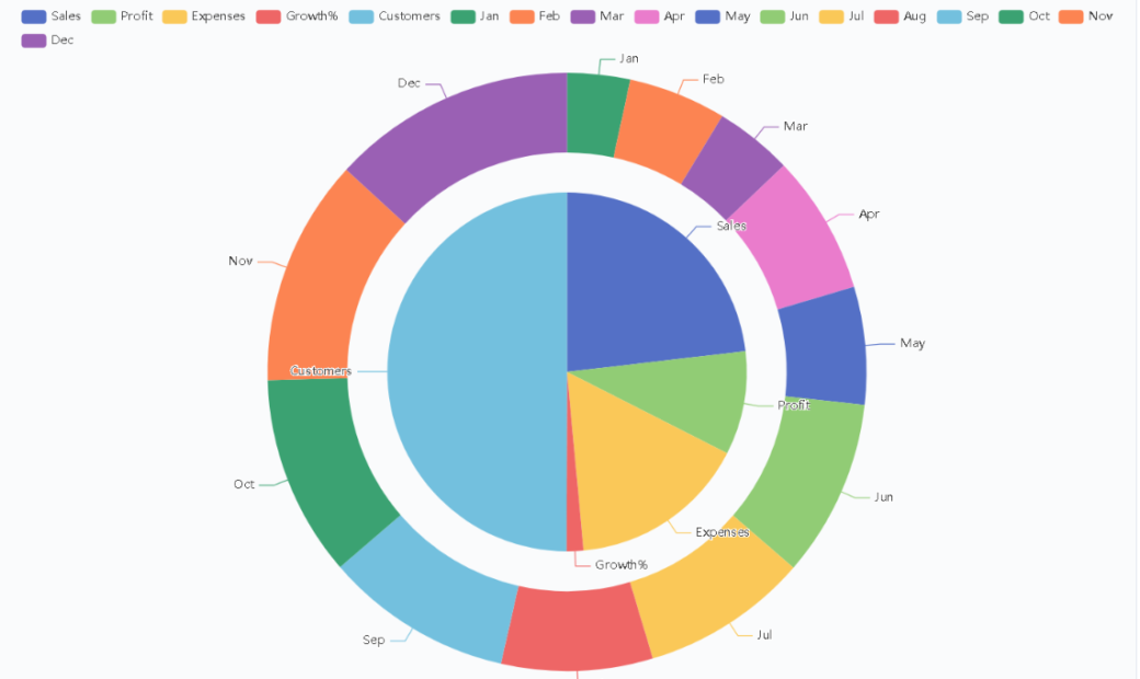
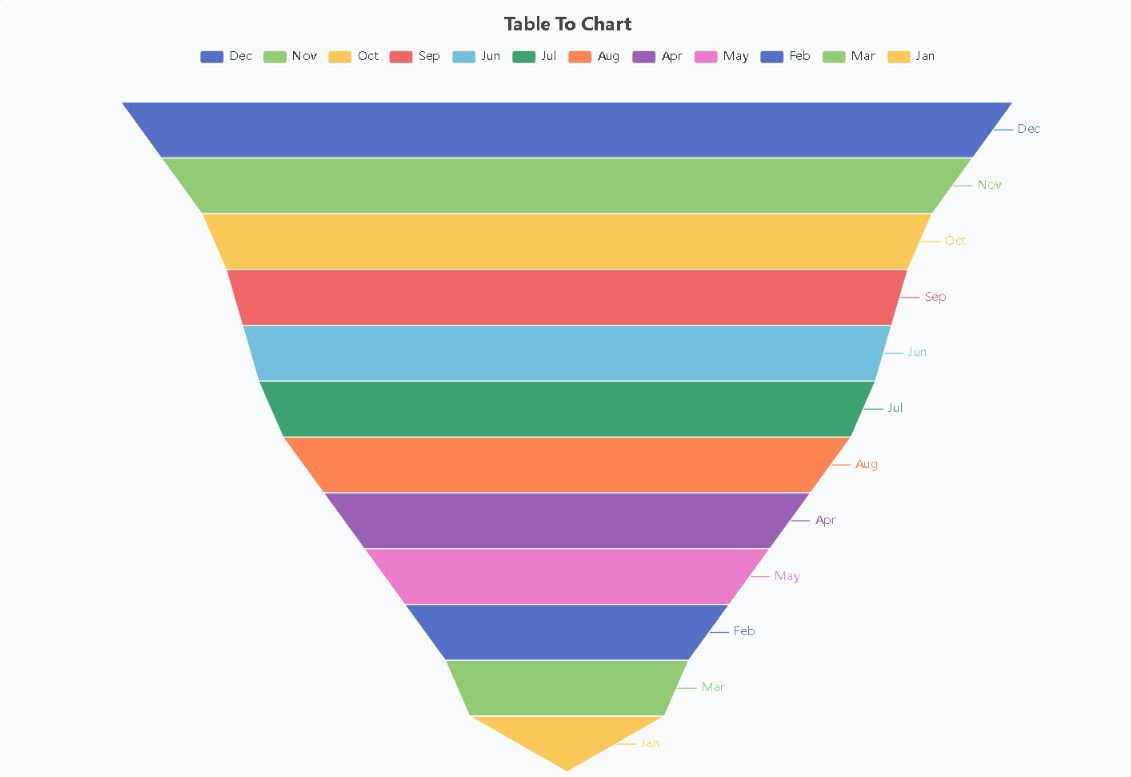
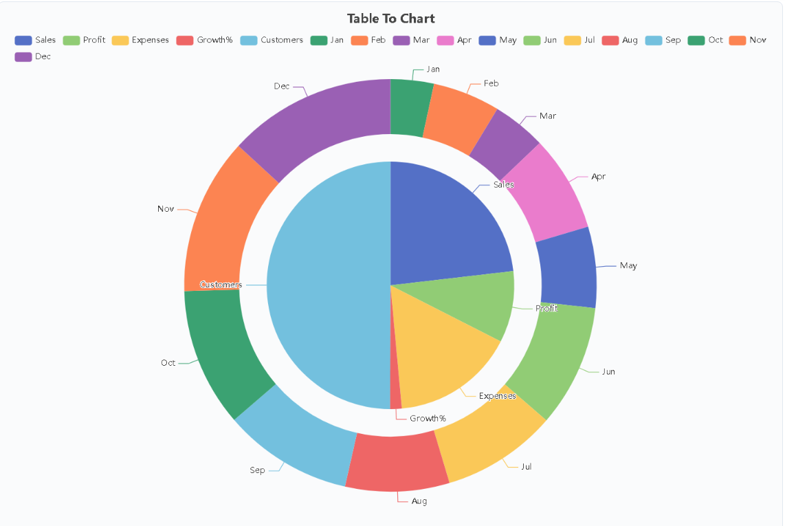
The catalogue covers the common reporting needs: spline, line, column, bar, pie, area, scatter, dual ring, radar, heatmap, and funnel. Trend lines track change over time, bars and columns handle side-by-side comparison, and pie or dual-ring views show proportional composition. A funnel view suits multi-stage conversion figures, a heatmap makes dense grids readable at a glance, and radar plots compare several dimensions of one subject in a single shape. Every type is available at no cost and every export comes out at high resolution. What the tool deliberately leaves out is just as important. There is no sign-up screen, no email gate, no watermark stamped across your chart, no locked chart types hiding behind a pro tier, no countdown timers, and no upgrade pop-ups. If a feature exists on the site, it works right now, for free, without asking who you are. That design decision matters because so-called free tools usually arrive with strings attached; here the absence of strings is the point, not a promotion.
Local-first handling for sensitive numbers
Privacy is the strongest argument for this approach. The tables people paste into chart tools tend to be the sensitive kind: internal sales figures, student grades, research measurements, client numbers. Everything here is generated locally in the browser. Tables and charts are never uploaded to a server, never logged, and never stored. Close the tab and they are gone. Compare that with the standard flow of signing up for a cloud dashboard, where your dataset sits on someone else’s infrastructure before you even see a preview. For analysts polishing a quick export, or teachers turning lab measurements into something students can hand in, that difference removes a whole category of worry. Founders and marketers who need one chart for one deck get the same benefit: no subscription, no account, no data trail. The same local-first design means the tool behaves identically on a shared classroom computer and a personal laptop, since nothing lingers in an account history or a cloud folder when the session ends.
Small details that save real time
The time savings come from details that sound minor until a deadline looms. Because the editor grows with your data, pasting a fifty-row table does not trigger a round of manual resizing. Because exports render at high resolution, the image survives projection on a large screen or printing in a handout without turning blurry. Because there is no login wall, sending a colleague a link is enough to get them productive in seconds rather than after an onboarding email chain. These choices compound: each removed step shortens the distance between raw numbers and a finished visual. People who prepare figures regularly know that most charting sessions are repetitive formatting rather than creative work, and cutting that formatting down to a single click is where the tool earns its place. Students converting experiment results into presentable figures, instructors building lesson diagrams, analysts making raw exports readable, and small-business owners assembling a single slide all fit the same pattern of urgency paired with simplicity. Development continues as well, with AI-assisted features being added to the chart workflow step by step, so the tool gets easier with each release and keeps meeting its original promise.